The Art of Science and the Science of Art: The BucephalusDev Design Model
Written by adminTaste is a function of intelligence; style is derived from taste.
What is taste? What is style? As we say in our own words at BucephalusDev, “Taste is a function of intelligence; style is derived from taste.” The trained-eye, and shall we say palate, has an acquired-taste for “design,” which by definition is the creation of a plan or convention for the construction of an object, system or measurable human-interaction; let’s face it folks, there is such a thing as “poor taste,” not necessarily influenced by finances as it is by education and intelligence- allow us to teach y’all a thing or two…
According to Don Norman, the godfather of human-centered design, the two most important characteristics of good design are discoverability and understanding:
- Discoverability: is it possible to figure out what actions are possible and where and how to perform the action?
- Understanding: What does it all mean? How is the product supposed to be used? What do all the different controls and settings mean?
Borrowing again from Norman’s seminal Design of Everyday Things, “good” product design ensures a human-centered approach that puts human needs, capabilities, and behavior first, then designs to accommodate those needs, capabilities, and ways of behaving, as fundamentally good design starts with an understanding of psychology- so if any product — from a kitchen-appliance to a website — ever requires additional instruction or guidance, it is inherently flawed by design; good design should never require instructions. The next time you feel frustrated while trying a new product, don’t feel bad! Blame the product-designer!
According to Google, on average, users spend approximately 177 minutes on their phones per day– that’s almost 3 hours!
At BucephalusDev, before we begin prototyping, we ask our clients: what is the definition of success? Generally, their goal is to change their business forever by attracting more customers online to get them off-line and into their front-doors. All too often, many business-owners approach a web-design agency with a pre-conceived notion in mind that a new website is the magic-bullet to reboot their business for the 21st Century, and mindlessly posting abound with social-media- nothing could be more delusional or detached from the science of web-development. Our strategic partners at SEO for Growth, championed by SEO thought-leaders Phil Singleton and Duct Tape Marketing’s John Jantsch, maintain that a website value-proposition, at a minimum, must answer the following questions:
- What is the definition of success?
- Who, exactly, is your ideal target audience?
- What type of content does your target audience like to consume?
- What are the goals and key-performance indicators (KPIs) that you hope to accomplish with your website and marketing?
- Which search terms does your target audience use when they need your product or service?
The reality today is that eyeballs are shifting away from the TV-screen and on to mobile devices. According to Google, on average, users spend approximately 177 minutes on their phones per day– that’s almost three hours! Acknowledging the aforementioned, we also note that 69% of smartphone users turn to mobile-search first in a moment of need– what does it all mean?
…we also note that 69% of smartphone users turn to mobile-search first in a moment of need– what does it all mean?
We treat every build with Occam’s Razor-as a design pattern– meaning all things being equal, the simplest application tends to be the right one. Quality design is logical, modular and mathematical, but at the end of the day, the question becomes what problem are we trying to solve? Our data-driven approach to web-development begins with strategy, structure, and tactical execution.
Simply stated, a website must be relevant to a user’s search! Our BootPress framework inherently respects convention over configuration without compromising customer-preferences insofar allowed as to remain competitive on the World Wide Web. As of today, every BucephalusDev production is robustly built from scratch according to the WordPress theme-template hierarchy, which is a modular, reusable framework easily “crawl-able” by Google Search engine “spiders” (i.e. “spiders” are “bots,” or collections of algorithms that “crawl” the “web”) and most importantly, scoped for a “mobile-first” user-experience with BootStrap– the world’s most popular HTML, CSS and JS framework for developing responsive, mobile first projects on the web. Our productions are inherently responsive by various form-factors- from the desktop to mobile-devices.
The BucephalusDev Design-Model is defined by 6 qualitative-attributes of measure and 14 mathematical-constraints conclusively determining the overall quality of design. Our hybrid-approach to design is derived from a myriad of testing-methodologies substantiated by graduate-research at The George Washington University in the field of human-computer interaction that cross-examines various user-types subjected to multiple base-case scenarios ultimately created to identify and benchmark consistencies promoting ideal human-centered design and any inconsistencies that might otherwise preclude a less than ideal user-experience- because there is always so much more than meets the eye!
The BucephalusDev Design Model: A Scientific Approach to User-Experience
According to the International standard ISO 9241 part 11, usability is the “the extent to which a product can be used by specified users to achieve specified goals with effectiveness, efficiency and satisfaction in a specified context of use.” The defining characteristic of usability testing is that the test environment and format of the testing is controlled by the evaluator. At BucephalusDev, we evaluate user-experience according to the following parameters provided thusly:
- Design | Aesthetic and Minimalist Design: A tasteful, but optimally-efficient user-experience according to “Occam’s Razor- as a design pattern,”- meaning all things being equal, the simple, most elegant solution tends to be the correct one.
- Efficiency | Consistency and Standards: Regardless of website application framework or programming language, a quality user-interface is modular and consistent, from the front-end to the back-end, for the optimal user-experience.
- Flexibility | Flexibility and Efficiency of Use: The best solution to the problem of designing for everyone is flexibility. If the test-user expressed trouble, could they independently resolve the matter without guided-assistance?
- Effectiveness | Match between Lab and Real World: Did the subject complete the assigned task without assistance? If not, how much help was required in order to achieve the assigned task?
- Attitude | User Control and Freedom: Recording of facial expressions, verbal comments and/or questions- including tone captured via screencast. The user will be required to perform the experiment via remote screen-share for review upon completion of the assigned experiment.
- Learnability | Help Users Recognize, Diagnose and Recover from Errors: If a mistake is observed or reported, we kindly request their attempt before providing additional guidance.
Concordantly, our BucephalusDev engineers design every user-interface according to the following constraints promoting ideal design; indeed, if logic and mathematics are universal, there is such a thing as an ideally “good” user-experience guided by quality user-interface design:
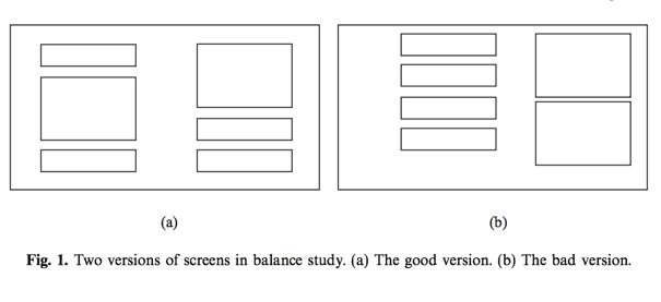
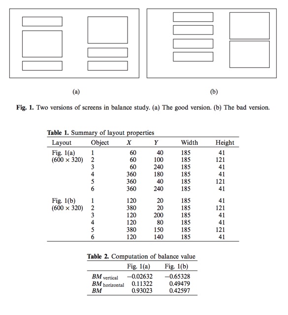
- Balance: can be defined as the distribution of optical weight in a picture; optical weight refers to the perception that some objects appear heavier than others: larger objects appear heavier, whereas small objects are lighter.
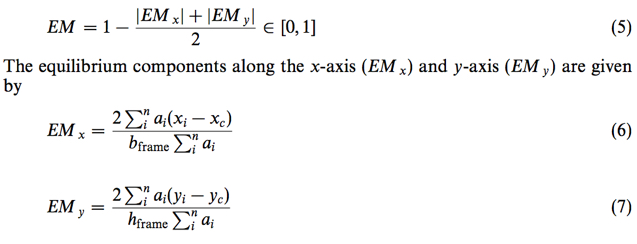
- Equilibrium: the stabilization, a midway center of suspension. Equilibrium on a screen is accomplished through centering the layout itself. The center of the layout coincides with that of the frame. Equilibrium is computed as the difference between the center of mass of the displayed elements and the physical center of the screen and is denoted by:
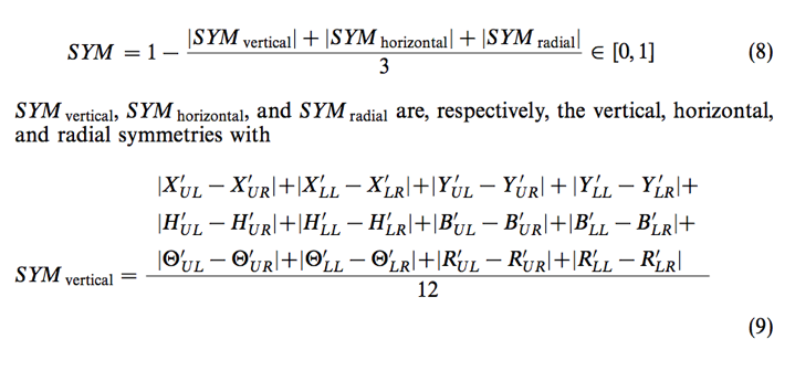
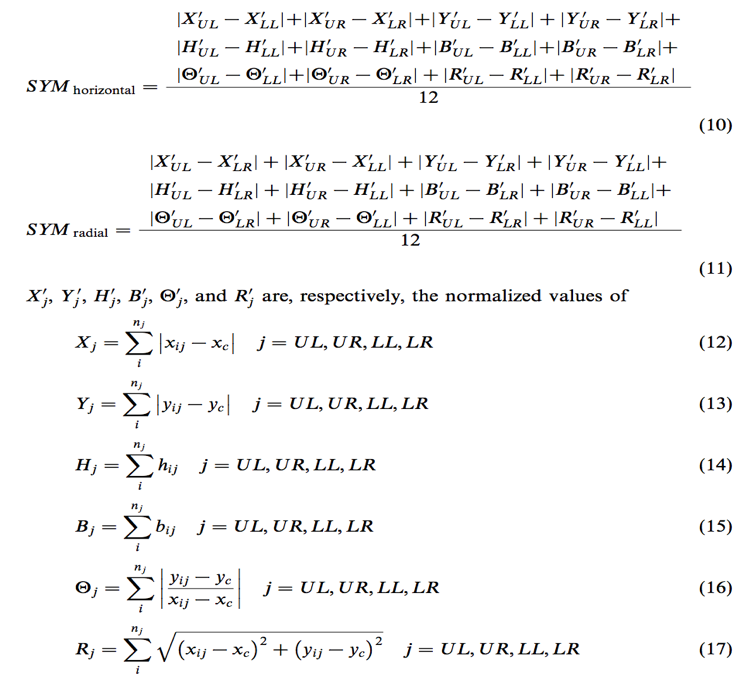
- Symmetry: is axial duplication- a unit on one side of the center-line is exactly replicated on the other side; vertical symmetry refers to the balanced arrangement of equivalent elements about a vertical axis and horizontal symmetry about the horizontal axis, whereas the radial symmetry consists of equivalent elements balanced about two or more axes that intersect at one point. The extent to which the screen is symmetrical in three directions: vertical, horizontal, diagonal. Symmetry, by definition, is the extent to which the screen is symmetrical in three directions: vertical, horizontal, diagonal given by:
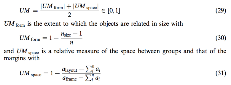
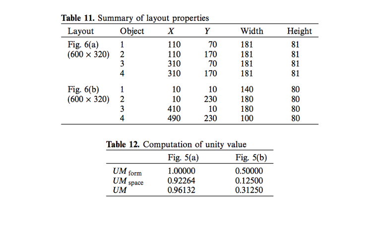
- Unity: is coherence- a totality or elements that is visually all one piece. With unity, the elements seem to belong together, to dovetail so completely that they are seen as one thing. Unity in screen-design is achieved by using similar sizes and leaving less space between elements of a screen than the space left at the margins. Unity by definition, is the extent to which the screen elements seem to belong together and is given by:
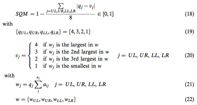
- Sequence: in design refers to the arrangement of objects in a layout in a way that facilitates the movement through the information displayed. Normally, the eye, trained by reading (in the Western-world) starts from the upper left and moves back and forth across the display to the lower right. Perceptual psychologists have found that certain things attract the eye; it moves from big objects to small objects. Sequence by definition is a measure of how information in a display is ordered in relation to a reading pattern that is common in the Western Cultures given by:
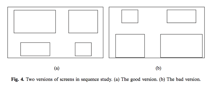
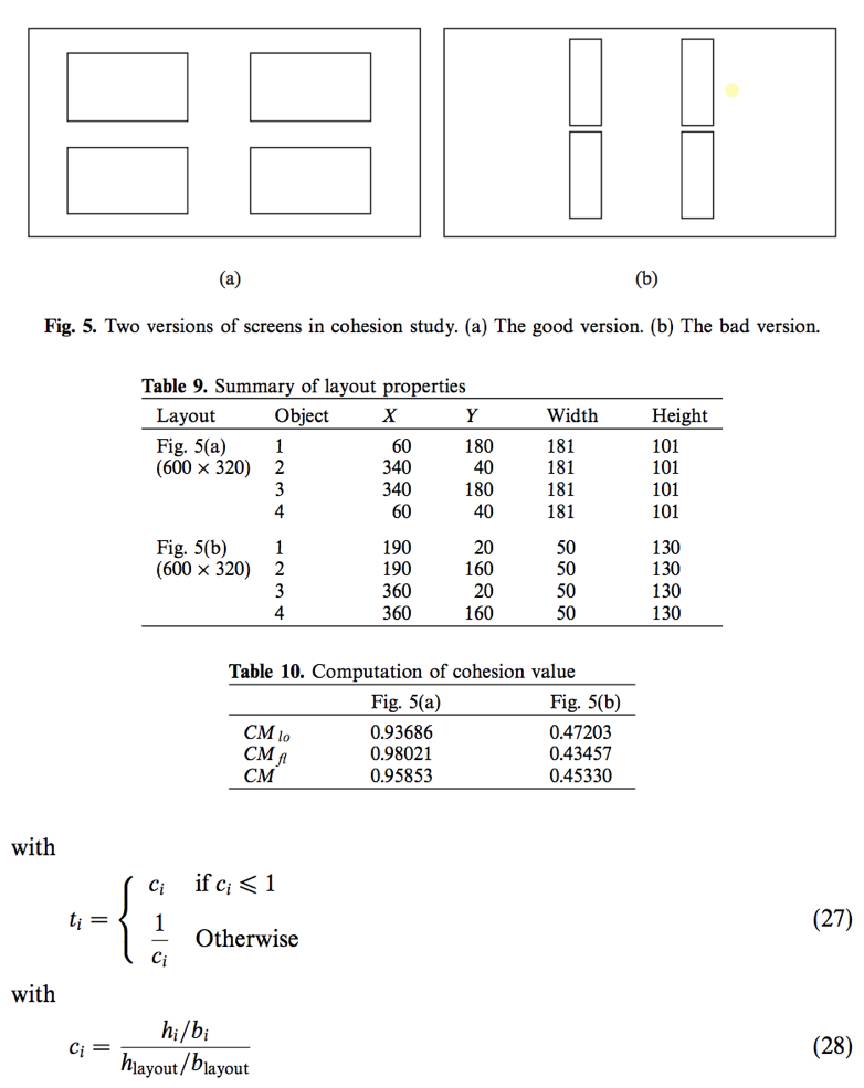
- Cohesion: in screen design, similar aspect ratios promote cohesion. The term aspect ratio refers to the relationship of width, while the opposite is true for typical VDU displays. Changing the aspect ration of a visual field may affect movement patterns sufficiently to account for some of the performance differences. The aspect ratio of a visual field should stay the same during the scanning of a display. Cohesion, by definition, is a measure of how cohesive the screen is and is given by:
- Proportion: By definition, proportion is the comparative relationships that should be considered for major components of the screen, including windows and groups of data and text. Throughout the ages, people and cultures have had preferred proportional relationships. What constitutes “beauty” in one culture is not necessarily considered “beautiful” by another culture. Although beauty may very well be in the eye of the beholder, some proportionalities transcend culture, space and time- many of which are enjoyed in abundance today. The following design-patterns remain consistent:
- Square (1:1)
- Square Root of Two (1:1.414)
- Phi (aka the “God Ratio”, or “Gold Ratio”) (1:1.618)
- Square Root of Three (1:1.732)
- Double Square (1:2)
- Simplicity: is directness and singleness of form- a combination of elements that results in ease in comprehending the meaning of a pattern. Simplicity in screen design is achieved by optimizing the number of elements on a screen and minimizing the alignment points. Tullis (1984) has derived a measure of screen complexity for text-based screens based on the work of Bonsiepe (1968), who proposed a method of measuring the complexity of typographically designed pages through the application of information theory. It involves counting the number of different rows or columns on the screen that are used as starting positions of alphanumeric data items. Information theory is then used to calculate the complexity of this arrangement of starting positions.
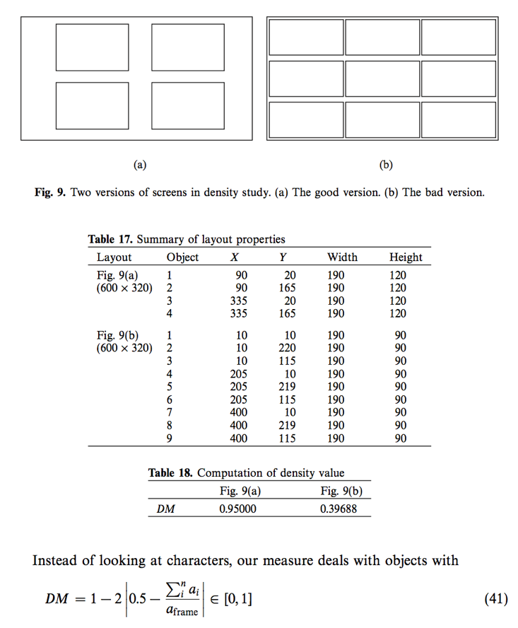
- Density: the extent to which the screen is covered with objects. Density is achieved by restricting screen density levels to an optimal percentage. A measure of density, derived by Tullis, is the percentage of character positions on the entire frame containing data.
- Regularity: is a uniformity of elements based on some principle or plan. Regularity in screen design is achieved by establishing standard and consistently spaced horizontal and vertical alignment points for screen elements, and minimizing the alignment points. Regularity is e measure of how regular the screen is, given by:
- Economy: is the care and discreet use of display elements to get the message across as simply as possible. Economy is achieved by using as few sizes as possible. Economy is the a measure of how economical the screen is and is given by:
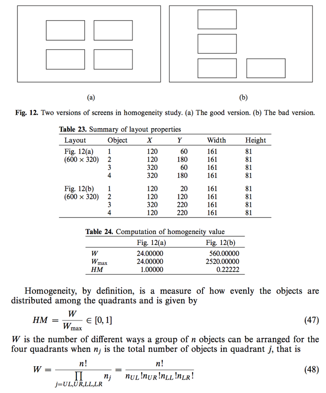
- Homogeneity: the relative degree of homogeneity of a composition is determined by how evenly the objects are distributed among the four quadrants of the screen. The degree of evenness is a matter of the quadrants that contain more or less nearly equal numbers of objects. Entropy was developed in physics in the nineteenth century and was applied later in astronomy, chemistry and biology. Entropy influenced almost every science. We interpret the statistical entropy concept for screen design. The entropy equation is given by:
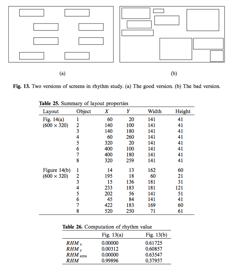
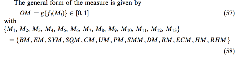
- Rhythm: in design refers to regular patterns of changes in the elements. This order with variation helps to make the appearance exciting. Rhythm is accomplished through variation of arrangement, dimension, number and form of the elements. The extent to which rhythm is introduced into a group of elements depends on the complexity (number and dissimilarity of the elements). Rhythm, by definition, is the extent to which the objects are systematically ordered and is given by:
- Order & Complexity: the measure of order is written as an aggregate of the above measures for a layout. The opposite pole on the continuum is complexity. The scale created may also be considered a scale of complexity, with extreme complexity at one end and minimal complexity (order).

Categories: BucephalusDev Tutorials, BucephalusDevProTip